All Together
in the Great, Big Helston Design Competition!
So Helston is teetering on the brink of being 'branded'. For those not too
sure about the use of this word in a context other than that of a cowherd
stamping a hot iron onto a cow's rear end as a charred claim of ownership,
it's a buzz word for a marketing an image that's immediately identifiable
from the Beckhams to beans.
Helston is a Cornish market town with a population
of around ten thousand and the gateway to the Lizard Peninsula. The town
was granted a charter in 1201 by King John, who had a penchant for dishing
out charters, as it was a stannary town that was given royal consent to weigh
tin ingots and until the River Cober became silted up, was an inland port
. The town's glory days were due to tin mining and the cattle market and
its claim to fame is the annual Furry Dance. This has its traditions in Medieval
paganism to celebrate the end of winter and the coming of summer with the
Hal-an-Tow in which St. Michael and St. George slaughter the dragon and the
devil. Victorian wealth and St. Michael's feast day commandeering the ancient
rites are the foundation of the modern Flora dance, held throughout the day
on 8th May. The highlight is the midday dance in which the town's 'worthies'
spruce themselves up in top hats and tails and flouncy frocks, to follow
the brass band booming out the repetitive refrain while the dancers hop,
skip and twirl through the winding streets.
Why disturb the sleepy little town from its
past by being 'branded'? Quite simply, if it doesn't respond with a nudge
into the future, it will die, commercially and productively. During the past
decade or so, the town has become a faded, shabby place and lost its individuality.
Family owned shops have closed and been boarded up or replaced by ubiquitous
charity outlets and branches of high street chain stores, while the cattle
market ceased during the BSE crisis. However, the town has dusted itself
down and shaken itself up as businesses have recognised the problems and
formed the Helston Business Improvement Partnership (HBIP) and appointed
a town centre manager; already, it's inspiring to see the shoots of regeneration.
An ambitious step has been taken to give the town a recognisable identity
- 'brand'- ahead of a planned marketing campaign and website.
It was all looking good up to this point. My
understanding is that designers have been hired to work with the Town
Council and the HBIP to create a series of images for the town's logo.
I know from experience how incredibly demanding it is for creative professionals
to come up with an idea that is original and attractive, particularly
when up against the opinions of committees and focus groups; inevitably,
too many opinions are thrown in the mix from people who really don't
know what they're talking about but feel obliged to comment and the objective
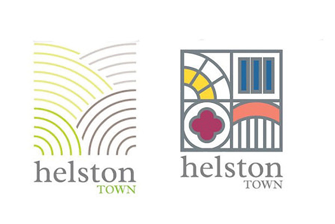
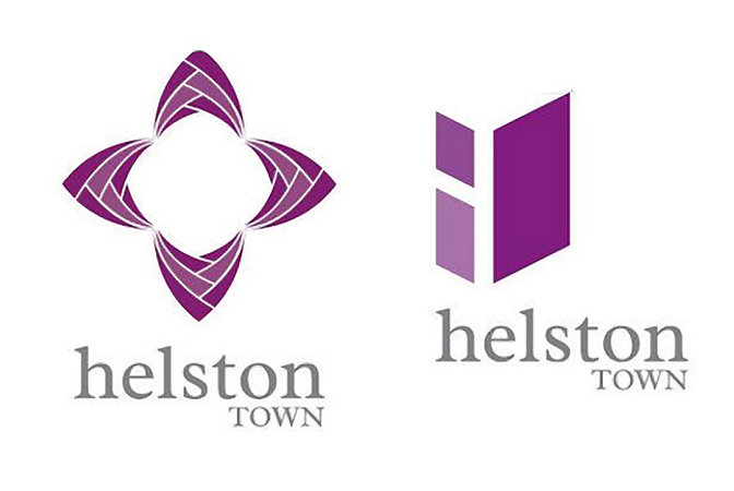
becomes blurred and fuzzy. As a consequence, the six designs that have
emerged are what my dear, departed father-in-law, called a 'dog's breakfast'
- by trying to be clever, the results are naively obscure and abstract.
These designs, which were considered to be the
best by HBIP, were revealed in the local press and then in a
move to be egalitarian, the public have been asked to vote for their
favourite in the Great, Big Helston Design Competition and the winning
design will be the new 'brand' for the town. Talk about asking for
trouble; whenever comments and opinions are invited, there's a compulsion
to say something, anything, no matter how daft, just because you can.
The poll in the local newspaper has revealed that 52% of those who
bothered to vote don't want any of the six designs!
We've been proprietors in professional design
partnership for a long time and have looked at the proposed
ideas objectively. In my opinion, it doesn't matter how much some might
try to move away from it, Helston's marque is Flora Day, a joyful,
Cornish celebration of music , dance and flowers - not paving stones,
flags, granite or architectural features on buildings as represented
in the designs to promote the town- these are mundane and prosaic.
Why attempt at dismiss the obvious when the iconography is unique!
We've added our comment constructively with a suggested idea.
 |
I've attached John's idea of a logo for Helston,
which sums up the town's image. If this design had a strap line, could
be, ' Helston - All together!'..lyrics from the Flora Dance, the townsfolk
working together and a reference to Cornwall's motto, 'One and All'.
The 'H' shapes, recognise Cornwall and its traditions with the use of
handlettered, calligraphic, Celtic letter form and the movement of the
shapes represents the swirling colours of the midday dancers dresses,
with contemporary delivery and approach of the design.
Design is subjective and one person's concept of
art is what another would chuck in the re-cycling, but what is never
wrong in this day and age of image and branding - is the cliche, ' you
can't get a second chance to make a first impression'. Helston needs
strong branding with character to represent a blend of the old and the
new; contemporary, progressive and nice place to be, but without denying
tradition and history and more than anything else, some sort of indication
that it is in Cornwall!
UPDATE
The process towards choosing the final design to repesent the town
occurred after a public voting process of shopkeepers asking customers
which of the six designs they preferred. So enthusiastic was the population
of ten thousand, that five hundred people registered their choice and
the winner is the star made from flags!!!
 Email
this page to a friend Email
this page to a friend
|